
ARCHETYPE
THE EVERYMAN
"All are created equal"
OUR VALUES
Our neighbor, our friend
We pride ourselves on our approachability. The oyster industry can be stuffy, but we’re not. That’s why we have customers return time and time again. Whether or not you’re an oyster connoisseur, you’re a friend to us.
Stay true to yourself
We have a lot to be proud of, but we don’t let it cloud our image. We don’t shift with the wind to appease a certain crowd. People appreciate our authentic selves, that’s why we’ve been in business for over 50 years.
We work for the common good
Hard work pays off. We’re more than an oyster company, we’re the embodiment of the Texas gulf oyster industry. For the last 50 years, we have worked hard to sustain the bay and educate our community. We don’t choose the easiest route, we choose the sustainable route.
How our values
TRANSLATE TO BRAND VOICE
OUR NEIGHBOR, OUR FRIEND
CASUAL, FRIENDLY
STAY TRUE TO YOURSELF
COLLOQUIAL, TRUE
WE WORK TOWARDS THE COMMON GOOD
INCLUSIVE, EDUCATIONAL
OUR LOGO:
THE SYMBOL OF OUR BAND
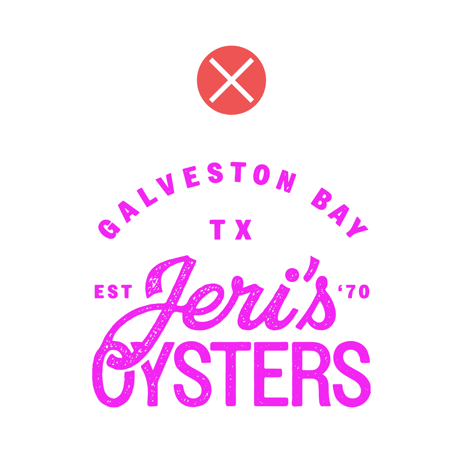
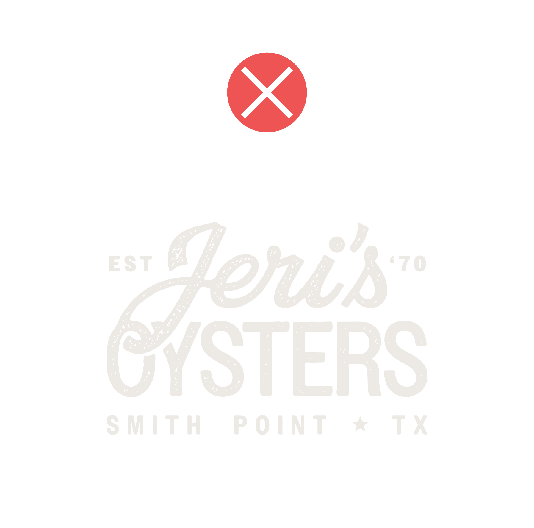
JERI'S OYSTERS
The Jeri's Oysters Logo embodies the Texan everyman in its use of hand-drawn illustration and rough around the edges type treatment. The "Jeri's" script further enforces the unique and hardworking Jeri's family due to being designed specifically for the brand.
The logo is easily scaled from its most basic to most complex form, and it can be broken apart into design elements for various uses. The PRIMARY LOGO versions are the combo mark and full combo mark designs, depending on the placement. The simplest form of the logo, the "J icon", is to be used in the most paired back instances, such as in the social media profile photo.


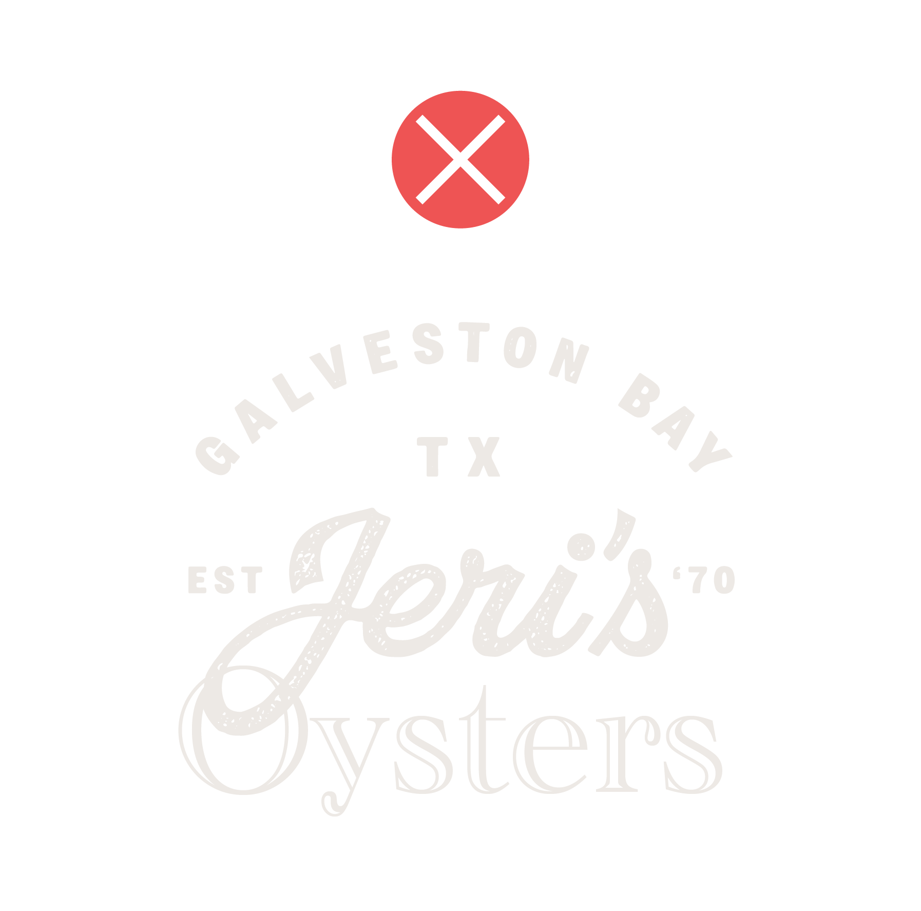
PARENT BRAND
JERI'S SEAFOOD
Jeri's Oysters' parent brand, Jeri's Seafood, is designed to compliment the main consumer facing brand's design. It utilizes the same hand drawn style illustration and roughened type treatment. In addition, the Texan everyman is reinforced through the use of the Texas star in the location lock-up.
The PRIMARY LOGO versions are the combo mark and word mark WITHOUT the boat screened behind it. This allows the logo to support the Jeri's Oyster logo when they are paired together rather than compete with it. The simplest form of the logo, the word "Jeri's" by itself, is to be used in the most paired back instances, such as when embroidered.


OUR LOGO:
USAGE
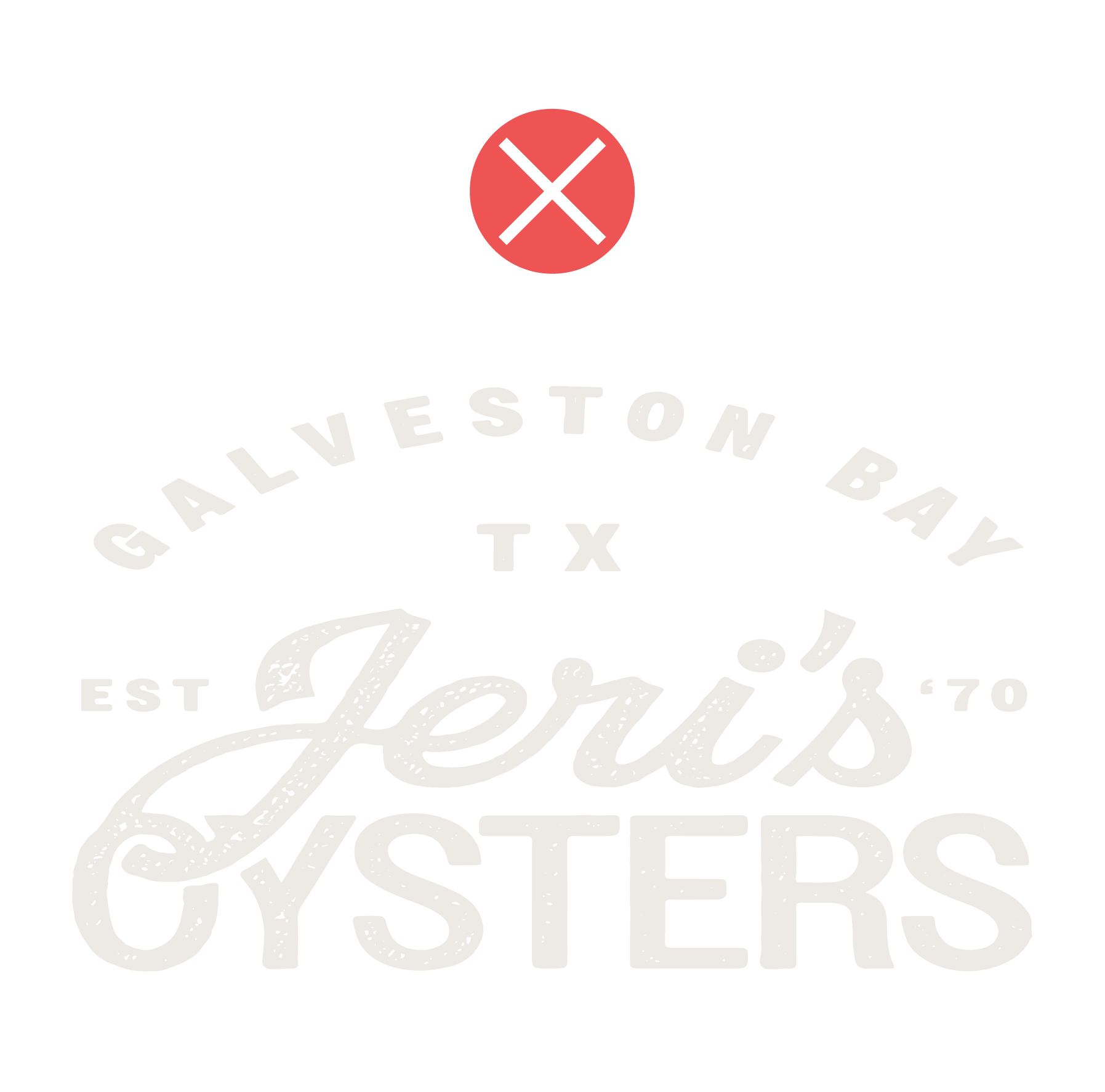
STEER CLEAR
When displaying/placing the logo, please ensure the use of clear space so no overlapping or other competing elements occur too close to the logo*.
For all logo variations, the clear space is defined as the same size as the height of the “s” in "Jeri's".
*Exceptions can be made for pattern/textural overlapping used at 20% opacity or less, or if the logomark is used as a design motif.
DON'T DO IT, Y'ALL
For all logo variations (and overall brand), please don’t do any of the following displayed below:
Use alternative brand colors
Distort the logo or elements
Mask images into the logo
Place on backgrounds that make logo illegible
Append alternative taglines or mix and match "Oyster" and "Seafood" logo elements
Use alternative fonts
DESIGN ELEMENTS

HEART ICON
This icon relates to the logo designs through the use of the same typeface and textured treatment. The first version highlights Jeri's top USPs: hand selected, wild caught, high quality oysters, while the second version speaks to Jeri's dedication to consumers.
This mark provides an alternative texture to use in brand applications, either in addition to or instead of the detailed illustrations. It is especially useful in cases when the incorporation of the detailed illustrations would be illegible or overused.


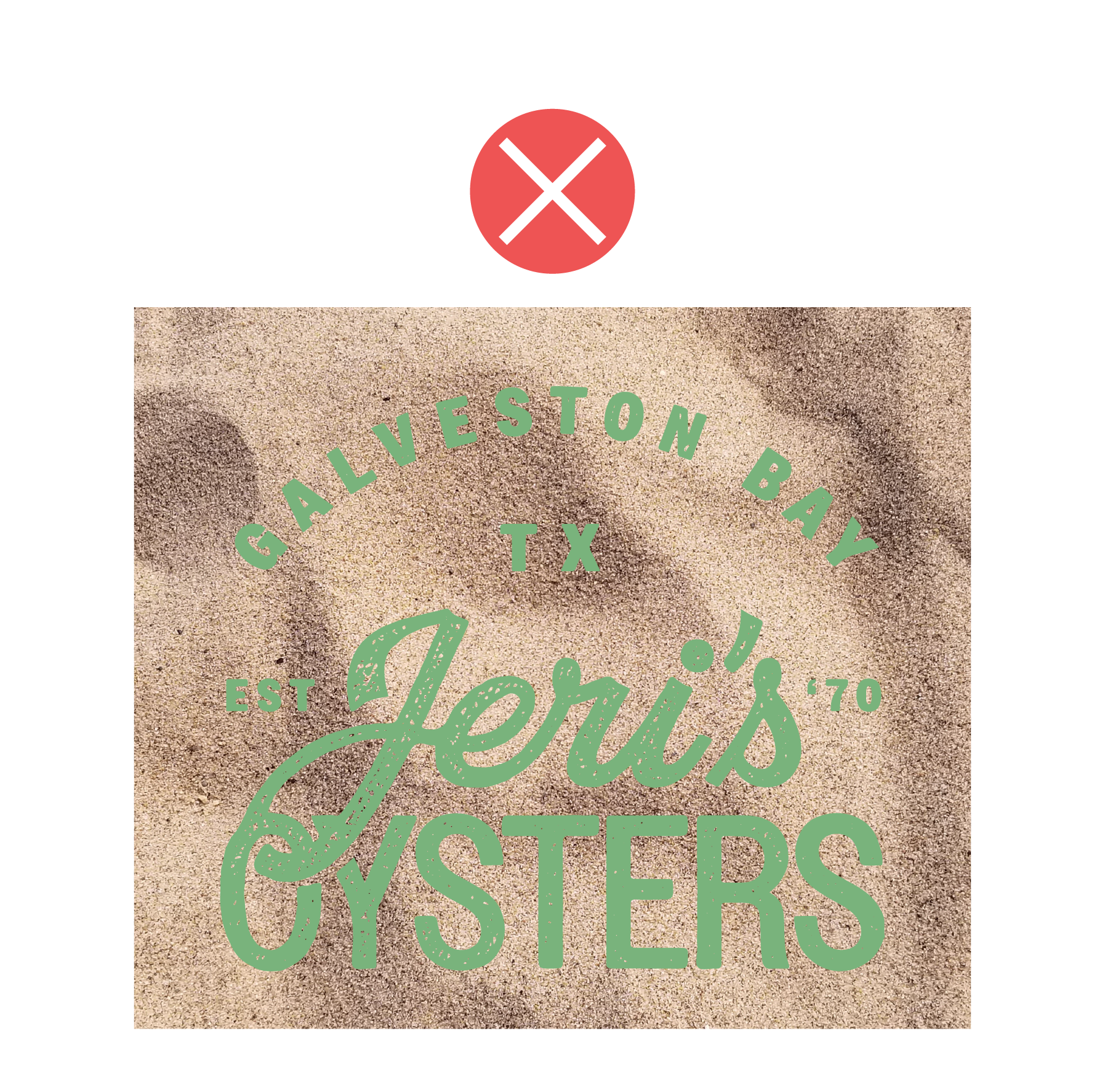
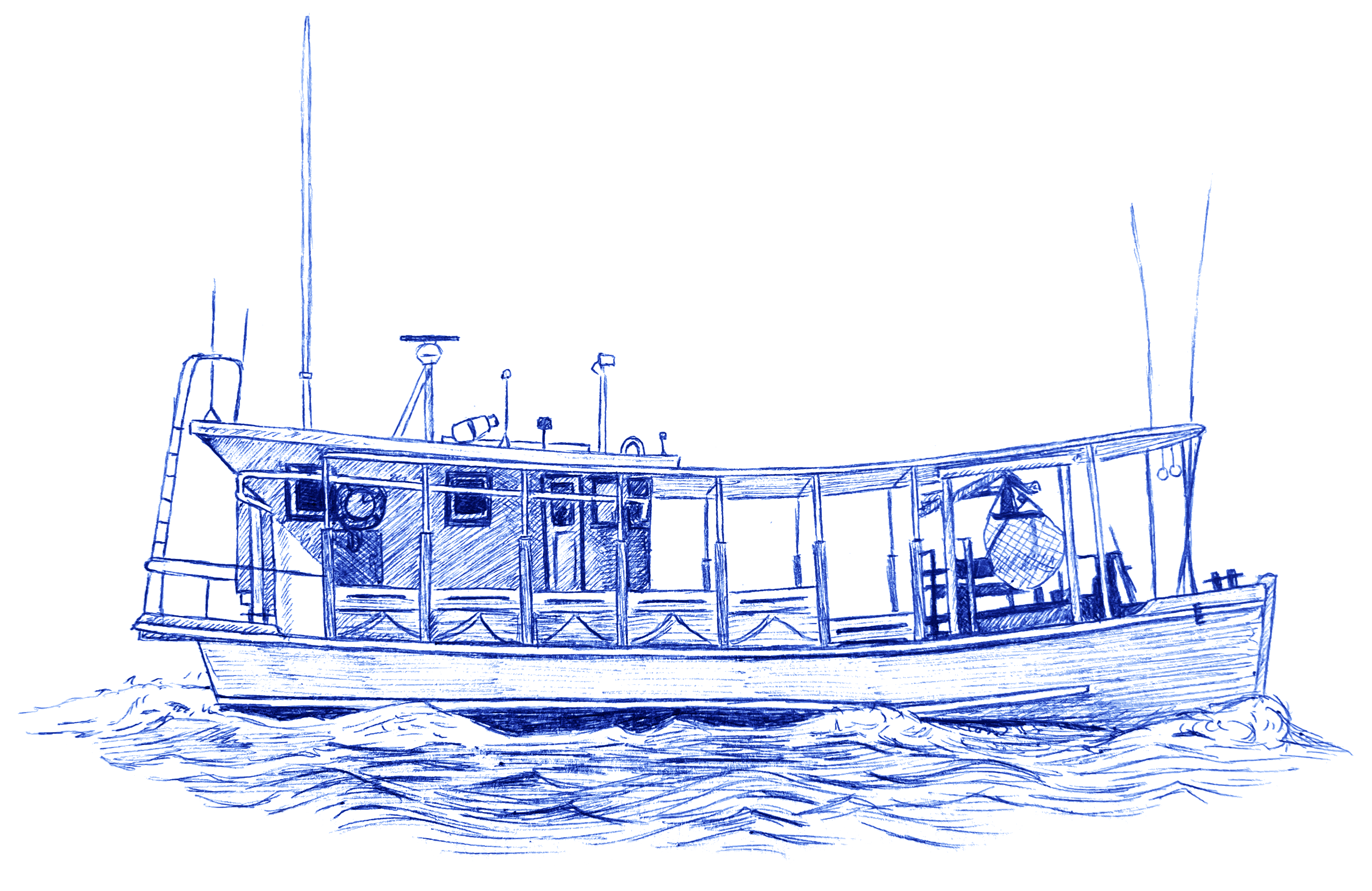
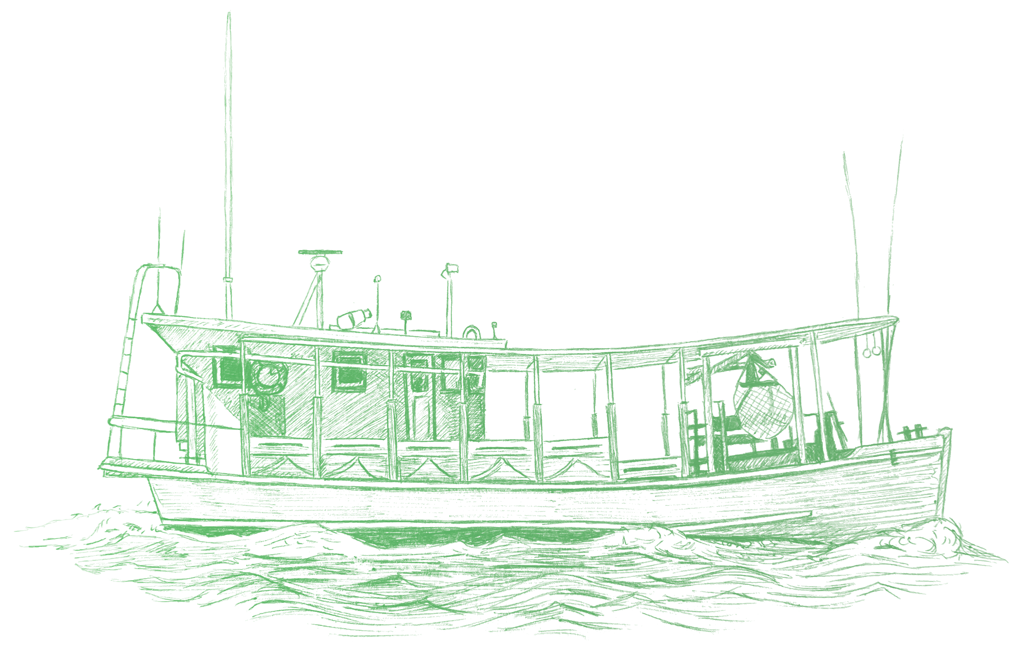
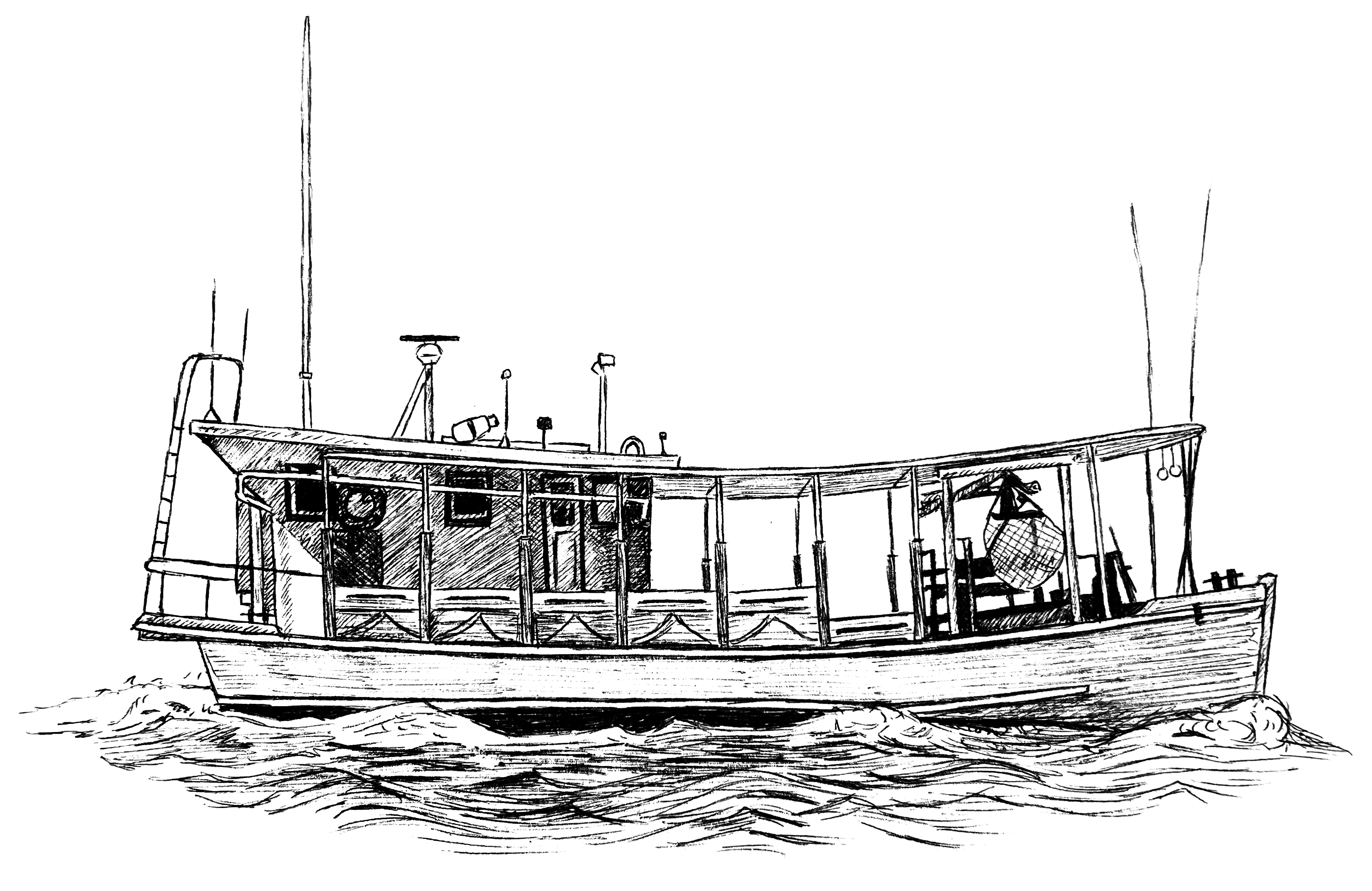
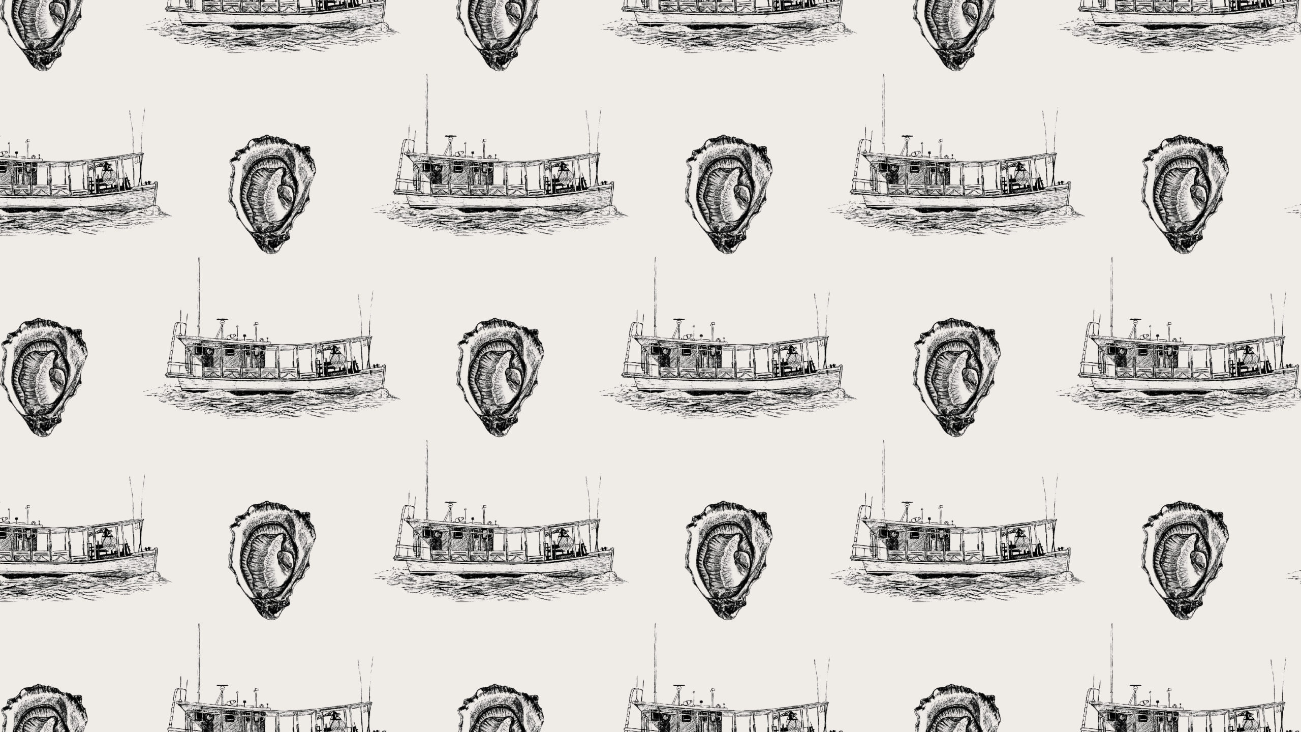
HAND-DRAWN ILLUSTRATIONS
This detailed OYSTER illustration represents the JERI'S OYSTERS brand in content and style, while the BOAT represents JERI'S SEAFOOD. The hand done renders reflect the hard work the Jeri's family puts into every aspect of the business.
These design elements are to be used on packaging and other brand applications to provide texture. Due to the ink style, they are not intended to be reversed on backgrounds (light illustration on a dark background).


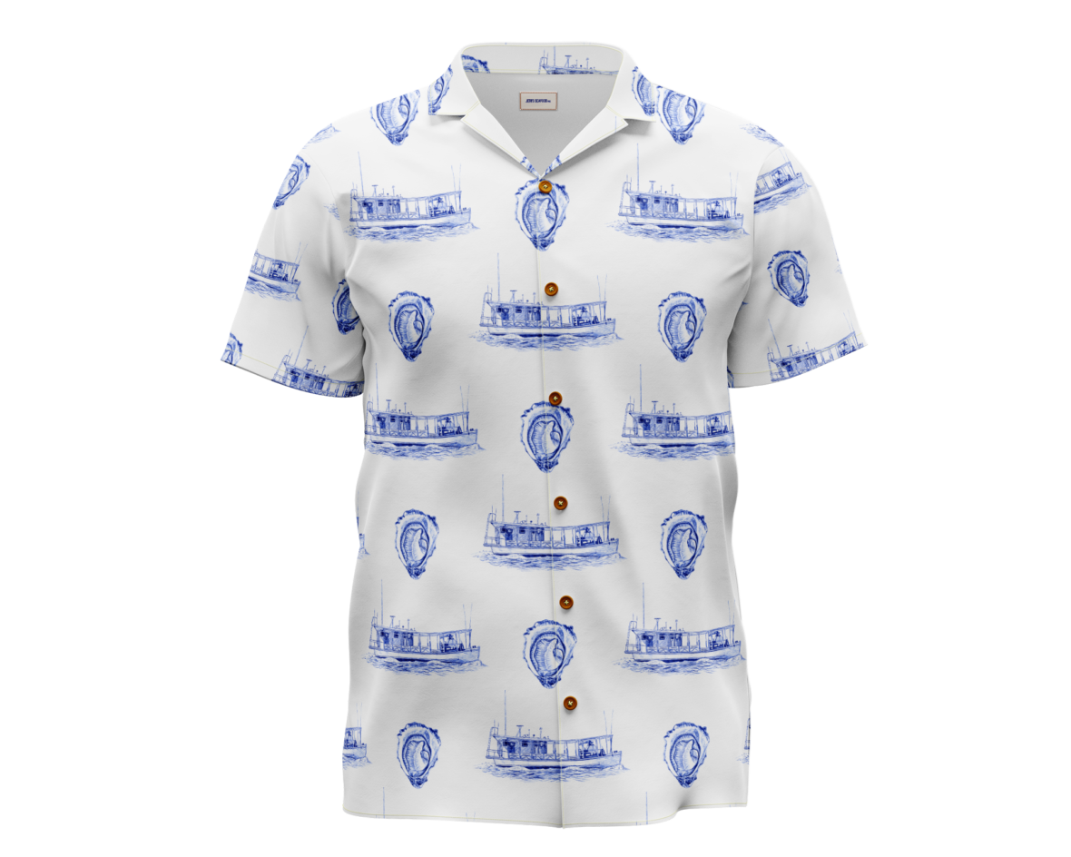
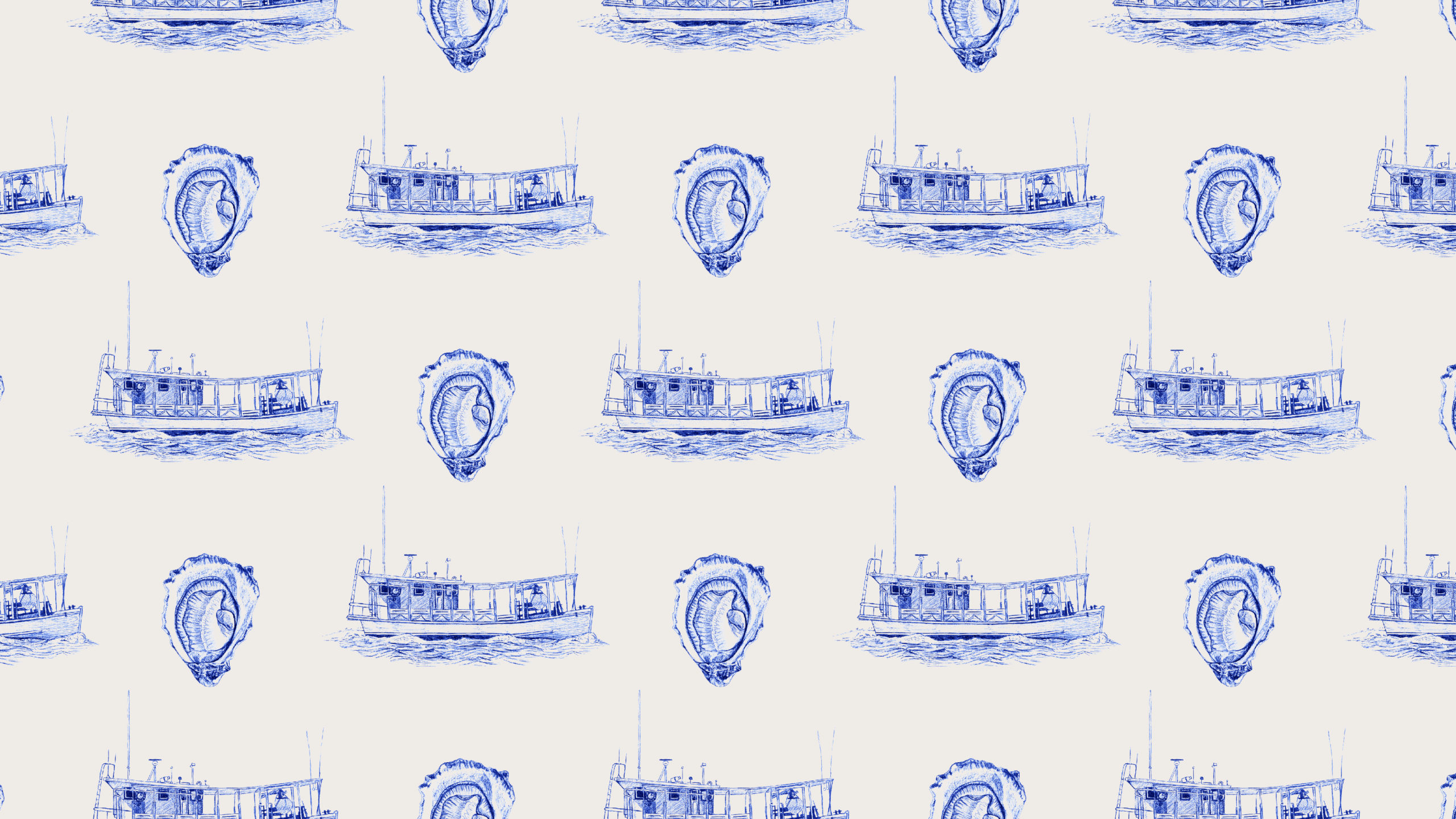
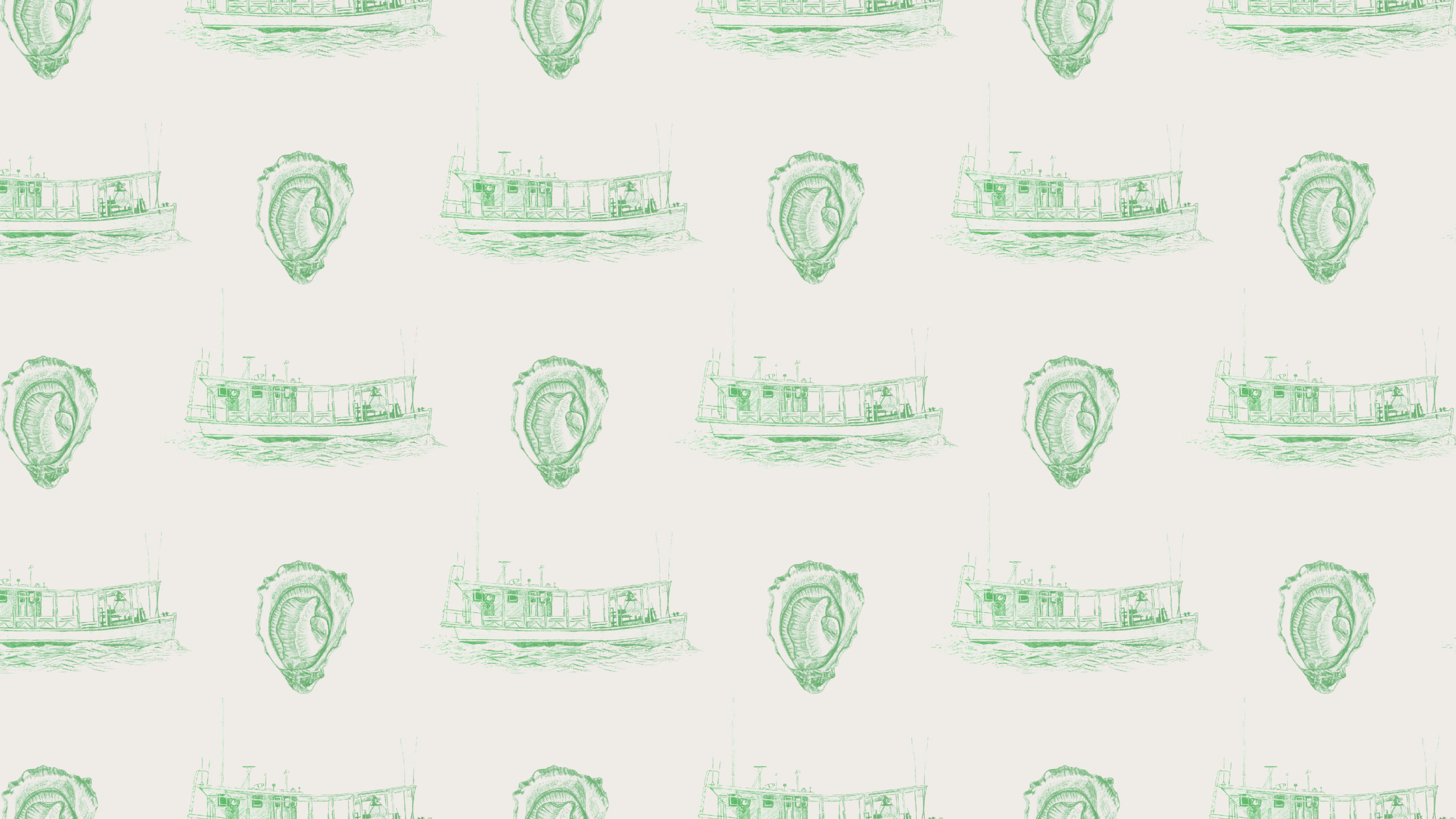
SEASIDE PATTERN
This pattern is an extra brand element designed to add visual texture and interest. It can be used on digital and printed assets and merch.
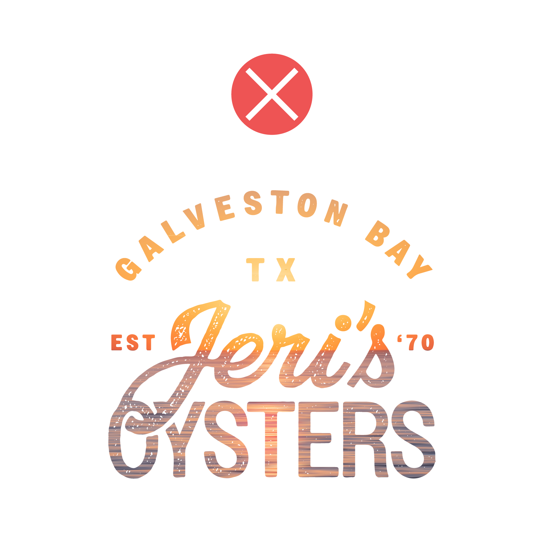
COLOR
An ode to the original brand packaging, JERI'S BLUE is the primary brand color. In the limited color palette, Jeri's Blue is the main color used for text and dark backgrounds. When there is only one color present representing the brand, let it be Jeri's Blue to reinforce strong brand recognition and ensure high contrast and legibility.
SUN BLEACHED SAND is inspired by the coast of the Galveston Bay, where Jeri's oysters are caught. It also provides a softer base as opposed to bright white to give the brand a vintage feel in respect of its history. It is meant to be used as text on dark backgrounds and the primary light base.
GALVESTON SEA GREEN is a romantic version of the color of the Galveston sea. It is to be used as a splash of color in the text, design elements, and backgrounds of key design instances. It is not meant to be used for large bodies of text, as the blue and sand colors provide better contrast.
JERI'S BLUE
- Hex 182c8b
- RGB 24, 44, 139
- CMYK 100, 81, 0, 13
- Pantone 661 C
SUN BLEACHED SAND
- Hex efebe7
- RGB 239, 235, 231
- CMYK 5, 5, 7, 0
- Pantone 482 C
GALVESTON SEA GREEN
- Hex 79B37C
- RGB 121, 179, 124
- CMYK 49, 5, 59, 0
- Pantone 2247 C
TYPOGRAPHY
Eyebrows/Subheads/BUTTONS | Owners Narrow Medium
Aa Bb Cc Dd Ee Ff Gg Hh Ii Jj Kk Ll Mm Nn Oo Pp Qq Rr Ss Tt 1 2 3 4 5 6 7 8 9 0 ! @ # $ % ^ & * ( )
HeadingS | ROCKY CONDENSED LIGHT
Aa Bb Cc Dd Ee Ff Gg Hh Ii Jj Kk Ll Mm Nn Oo Pp Qq Rr Ss Tt 1 2 3 4 5 6 7 8 9 0 ! @ # $ % ^ & * ( )
BODY | AGENDA REGULAR
Aa Bb Cc Dd Ee Ff Gg Hh Ii Jj Kk Ll Mm Nn Oo Pp Qq Rr Ss Tt 1 2 3 4 5 6 7 8 9 0 ! @ # $ % ^ & * ( )
APPLICATION
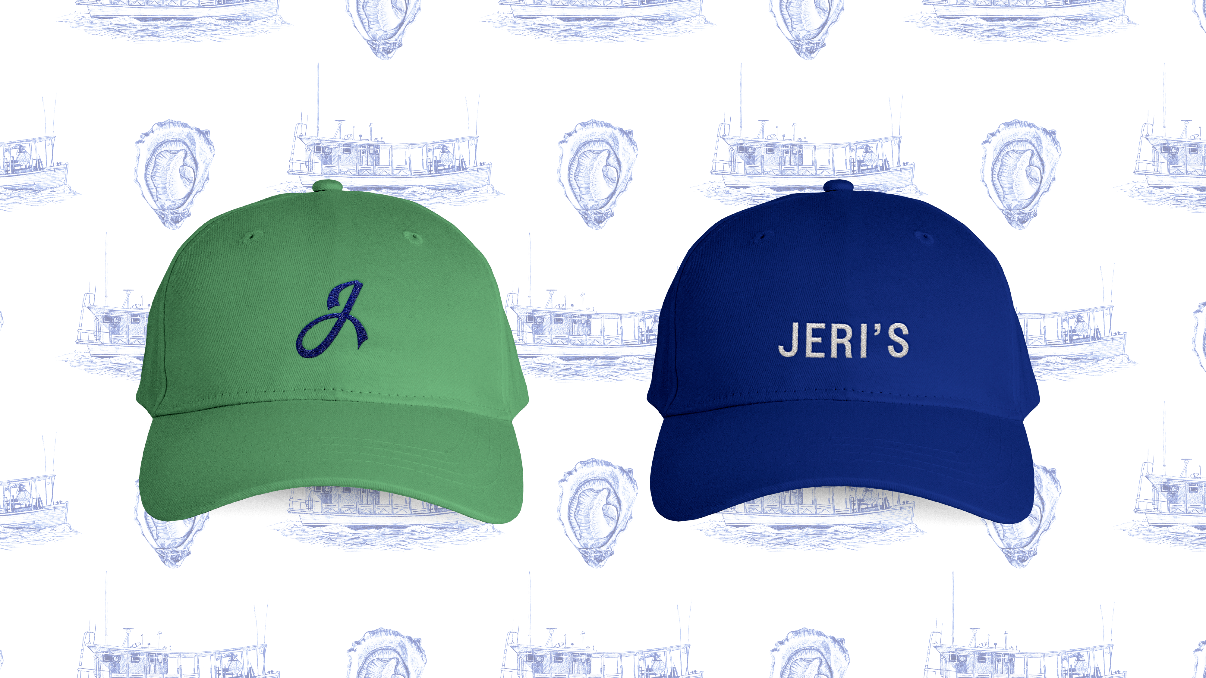
Baseball Hats
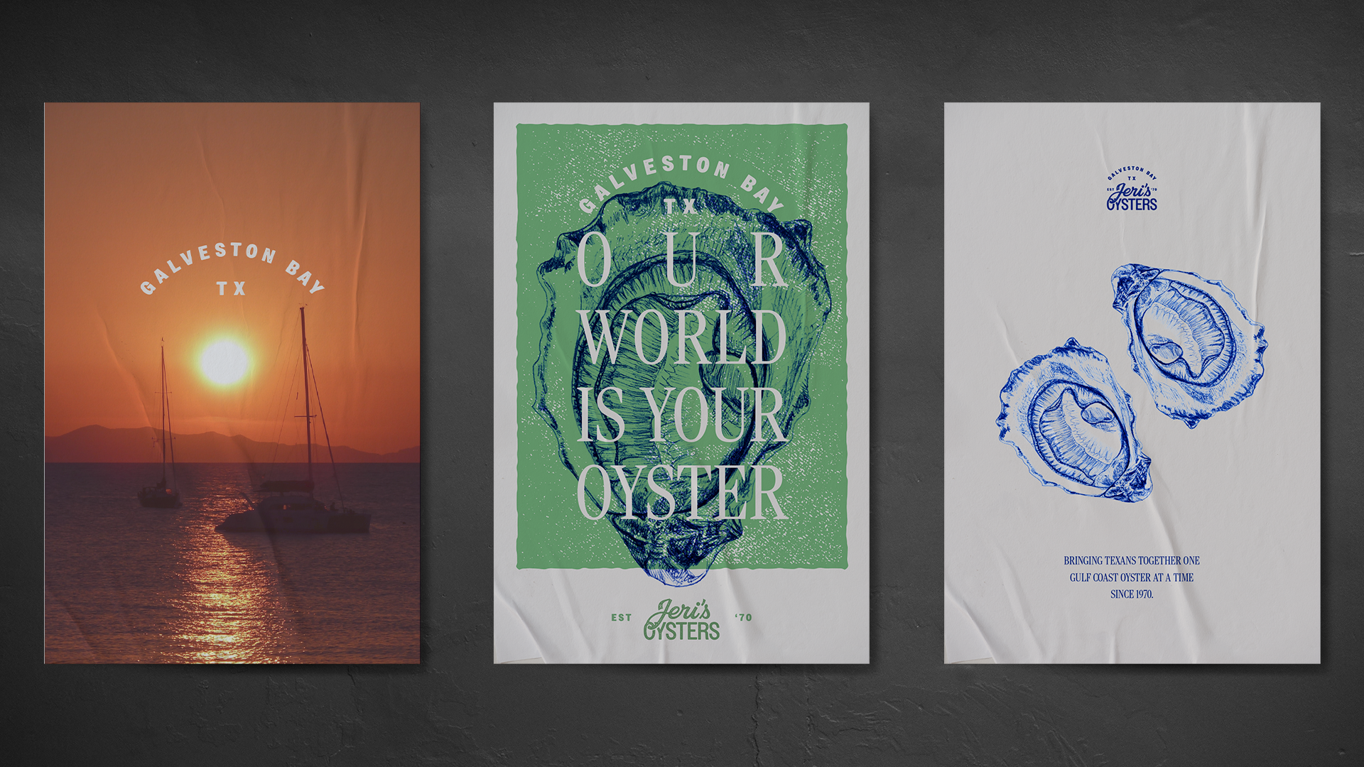
Posters
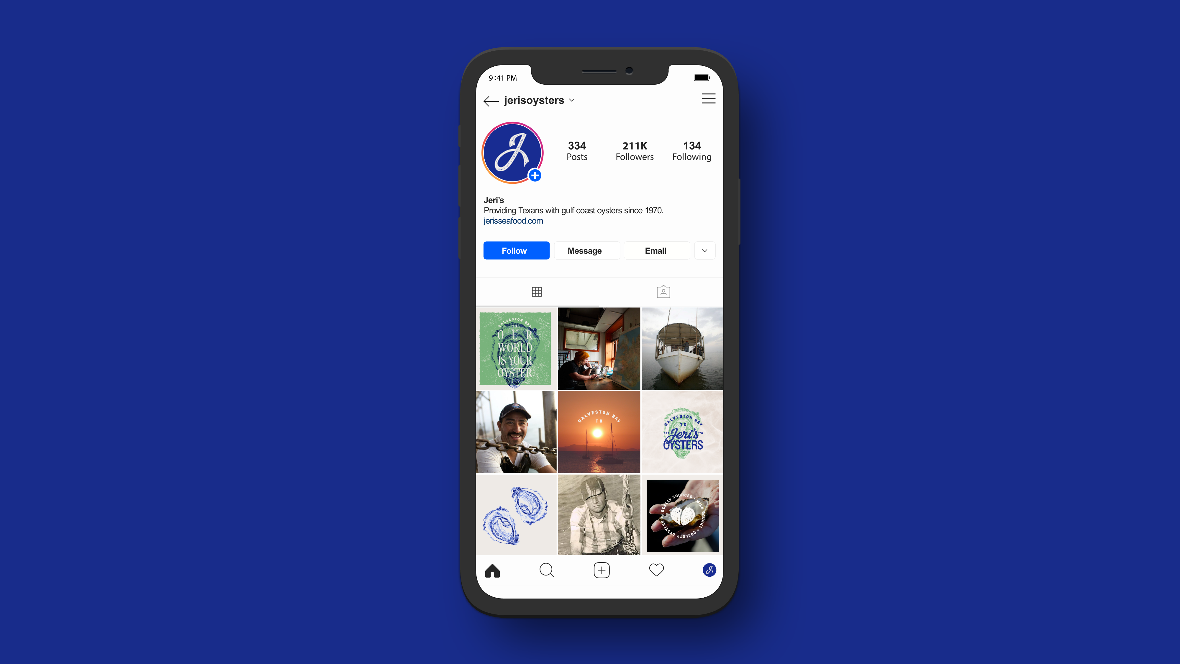
Social Media
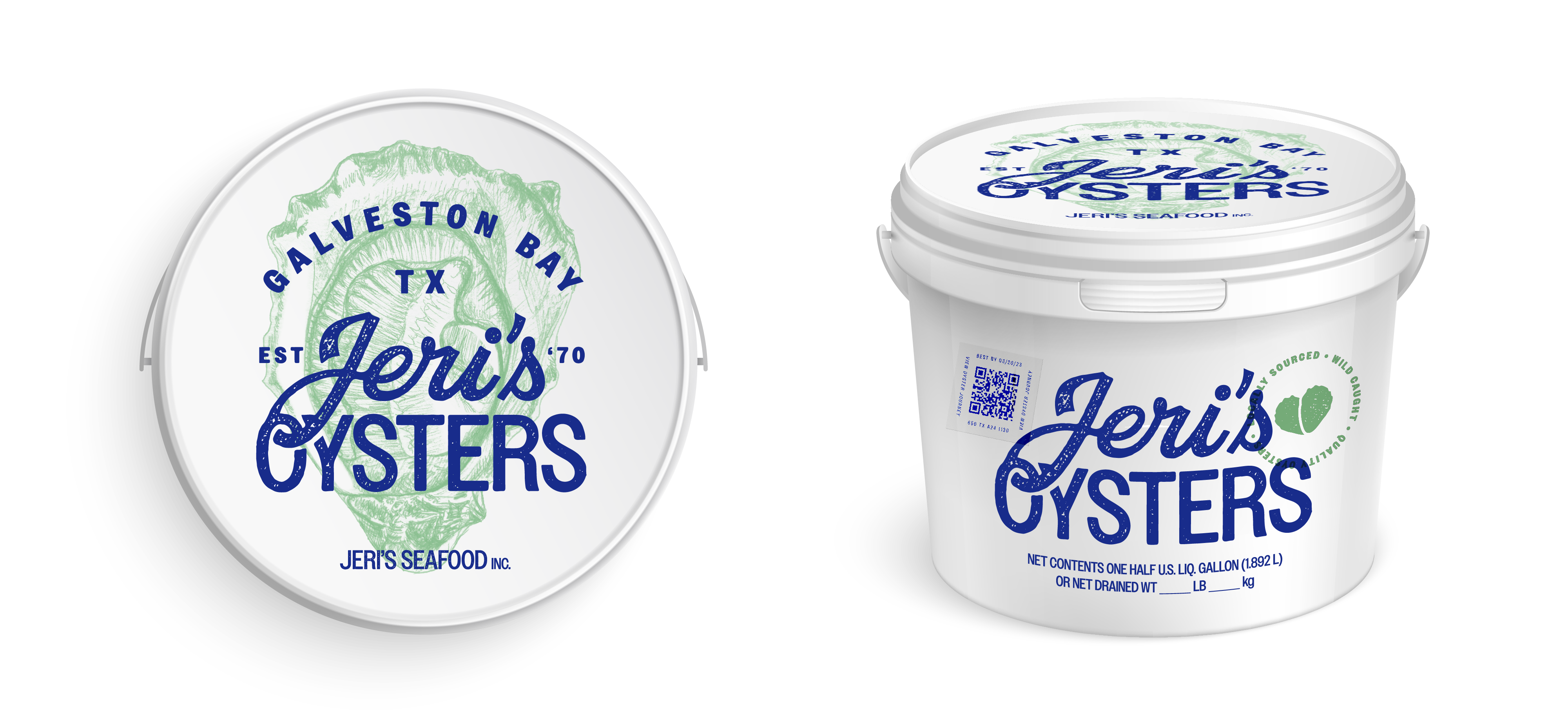
Packaging
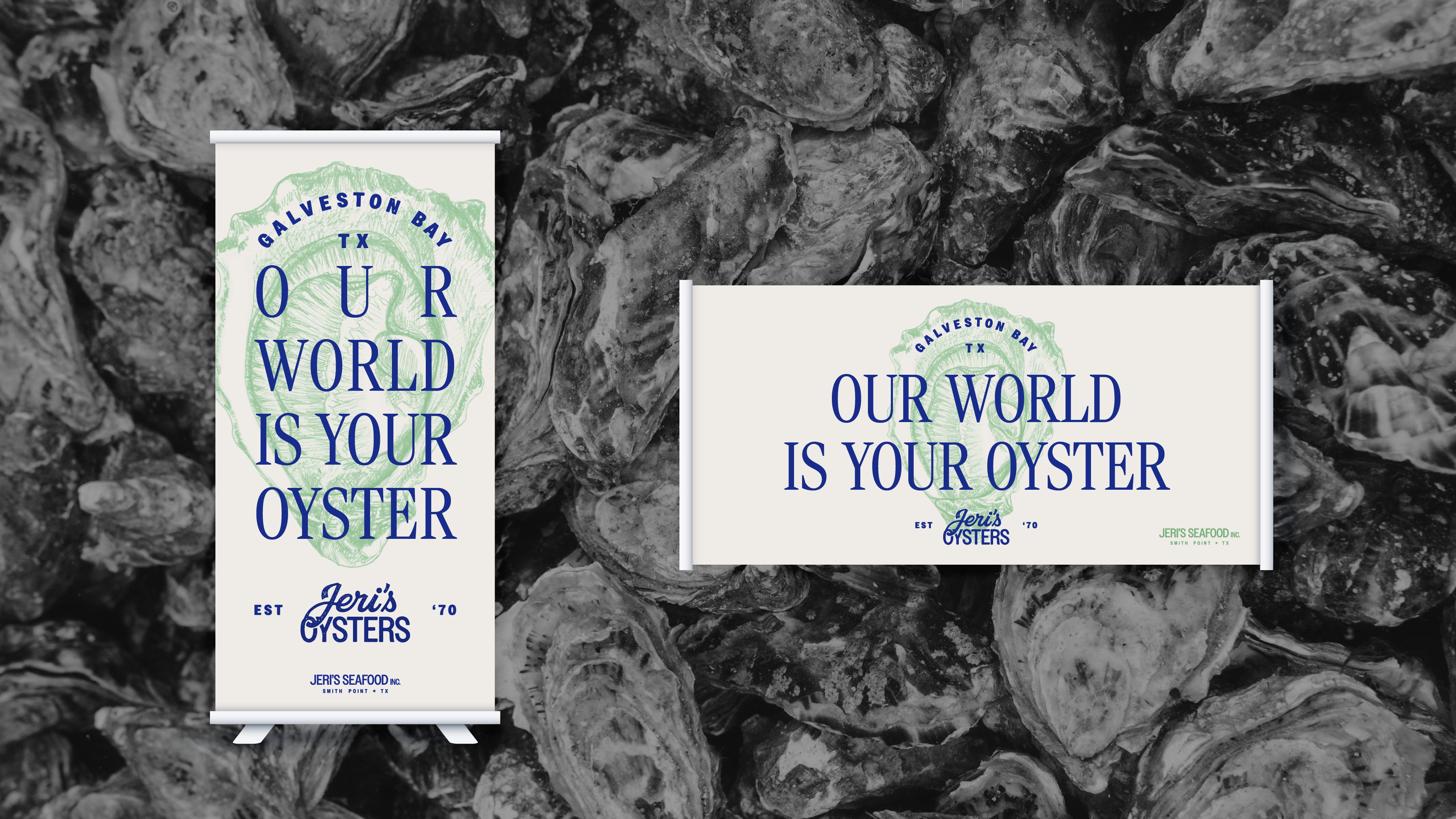
Vertical & Horizontal Banners
Website